
KOMO News App
Background
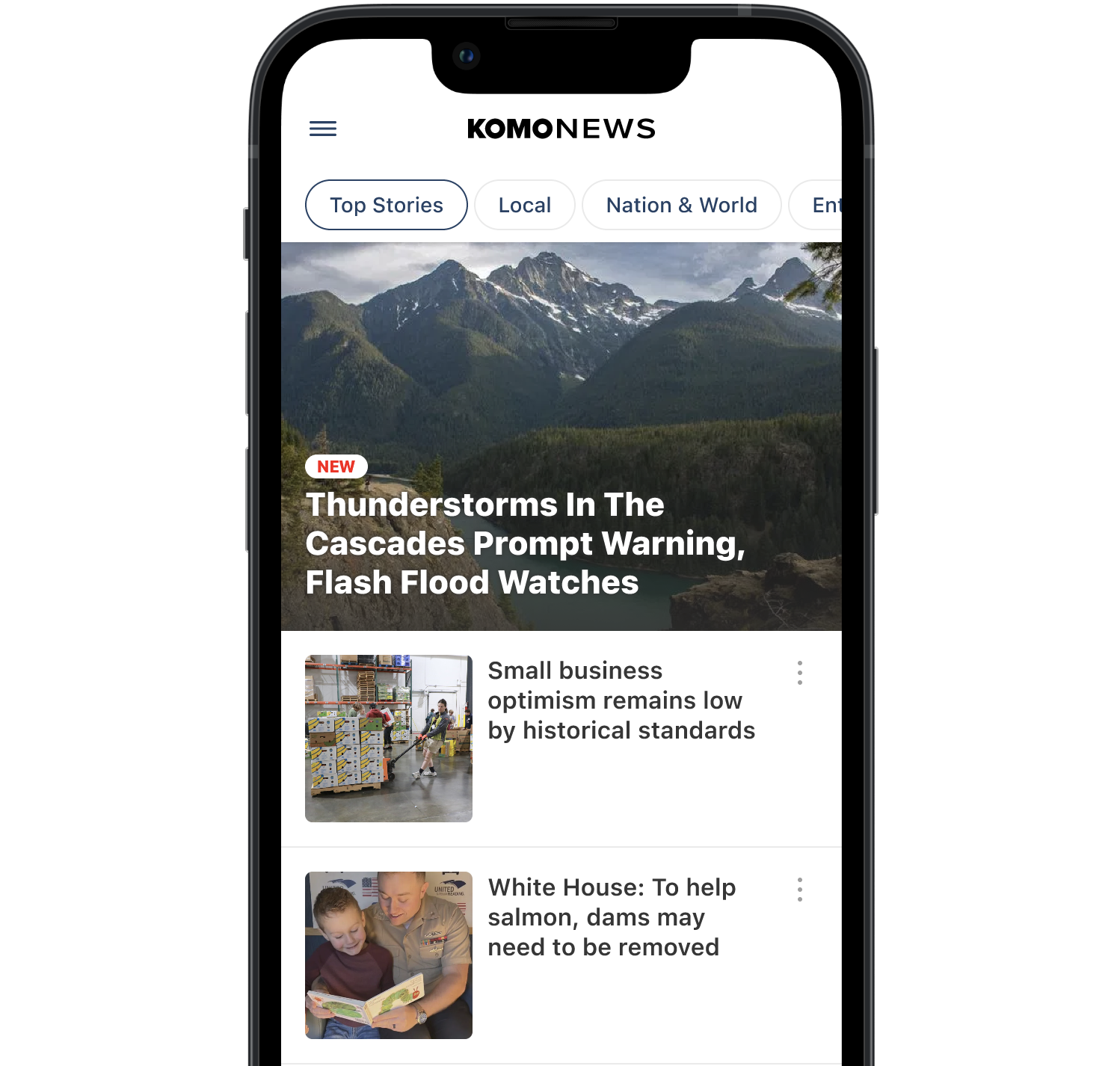
The KOMO News app used a traditional, editor-curated list of articles. As people moved toward short, scrollable content, that format stopped connecting with newer audiences. This project tested a new short-form experience added alongside the old interface to help users switch over gradually.
Role
I led end-to-end product design, delivering a complete solution rolled out through phased beta releases. I conducted competitive research, defined user flows, and designed the core short-form experience and its integration. I created wireframes, high-fidelity designs, and prototypes, collaborated with design leadership and peers, presented to stakeholders, and partnered with engineers during implementation.
Scope
The redesign added a short-form content view alongside the existing list view. Main features: a short video feed, AI summaries, navigation between new and old views, onboarding, and A/B testing for rollout. The first release focused on video because of technical and content limits; other features will come in later updates.
Tools Used
Figma, Adobe Illustrator
Context
The existing experience on KOMO News was designed around a traditional, editor-curated list of articles.
Users actively browsed through structured headlines to discover content. While effective for long-time audiences, this model increasingly struggled to engage younger users who expect faster, more continuous content experiences.
Internal data showed a strong demographic skew toward users aged 55 and above, highlighting a growing gap between the current experience and modern content consumption behavior.
At the same time, news consumption across digital platforms was shifting toward short-form, feed-based interaction models.

Opportunity
As platforms like TikTok, Instagram, and YouTube reshaped how users consume content, expectations around speed, personalization, and continuous scrolling became standard.
This created an opportunity to explore a new model for news consumption—one that shifts from intentional browsing to passive discovery.
Leadership initiated a redesign effort focused on introducing a short-form, video-first experience inspired by these behavioral shifts.
The goal was not to replace the existing system entirely, but to explore a parallel experience that could evolve alongside it.
Exploration
To understand how short-form and news content could coexist, I conducted a competitive analysis across both categories. This included platforms such as Inshorts, alongside major social and video platforms.
Key observations
Short-form video platforms have established consistent interaction patterns such as vertical scrolling and infinite feeds
News applications largely remain anchored in static or list-based navigation
Summary-based news apps reduce reading friction, but often lack depth and multimedia integration
There is no widely adopted model combining AI summaries, video shorts, and structured news context
Design direction
Rather than introducing new interaction models, the approach focused on adapting familiar behaviors. Vertical scrolling became the primary navigation pattern, supported by feed-based discovery instead of manual browsing.
Content was designed to be lightweight and glanceable, making it easier to consume quickly. The intent was to align with existing user mental models while introducing a new content structure.
Principles
From this exploration, several core principles guided the design direction.
Speed and clarity
Content should load quickly and be immediately understandable.
Familiar interaction patterns
The experience should leverage established scrolling and feed behaviors.
Accessibility across user groups
The design must remain usable for both younger audiences and long-time older users.
Controlled depth
AI-generated summaries should be concise, informative, and intentionally non-exhaustive.
Solution
The redesigned experience introduces a new model for news consumption centered around short-form, feed-based interaction while maintaining continuity with the existing system.
Entry and experimentation
To validate the new experience while minimizing risk, the feature was introduced through an A/B testing framework.
Users were split into two groups. One group experienced the shorts interface as the default entry point, while the other remained in the existing list view with additional entry points into the shorts experience.
Within the list view, a horizontal teaser module exposes users to short-form content, allowing gradual discovery without forcing a full transition. Onboarding overlays and tooltips were implemented across both variants to guide users through the new interaction model.
Shorts feed
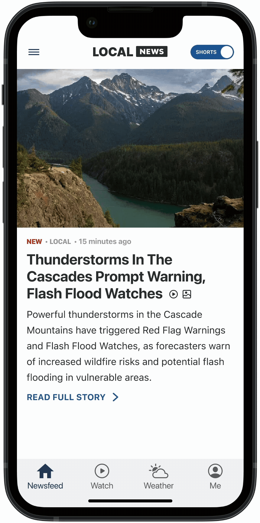
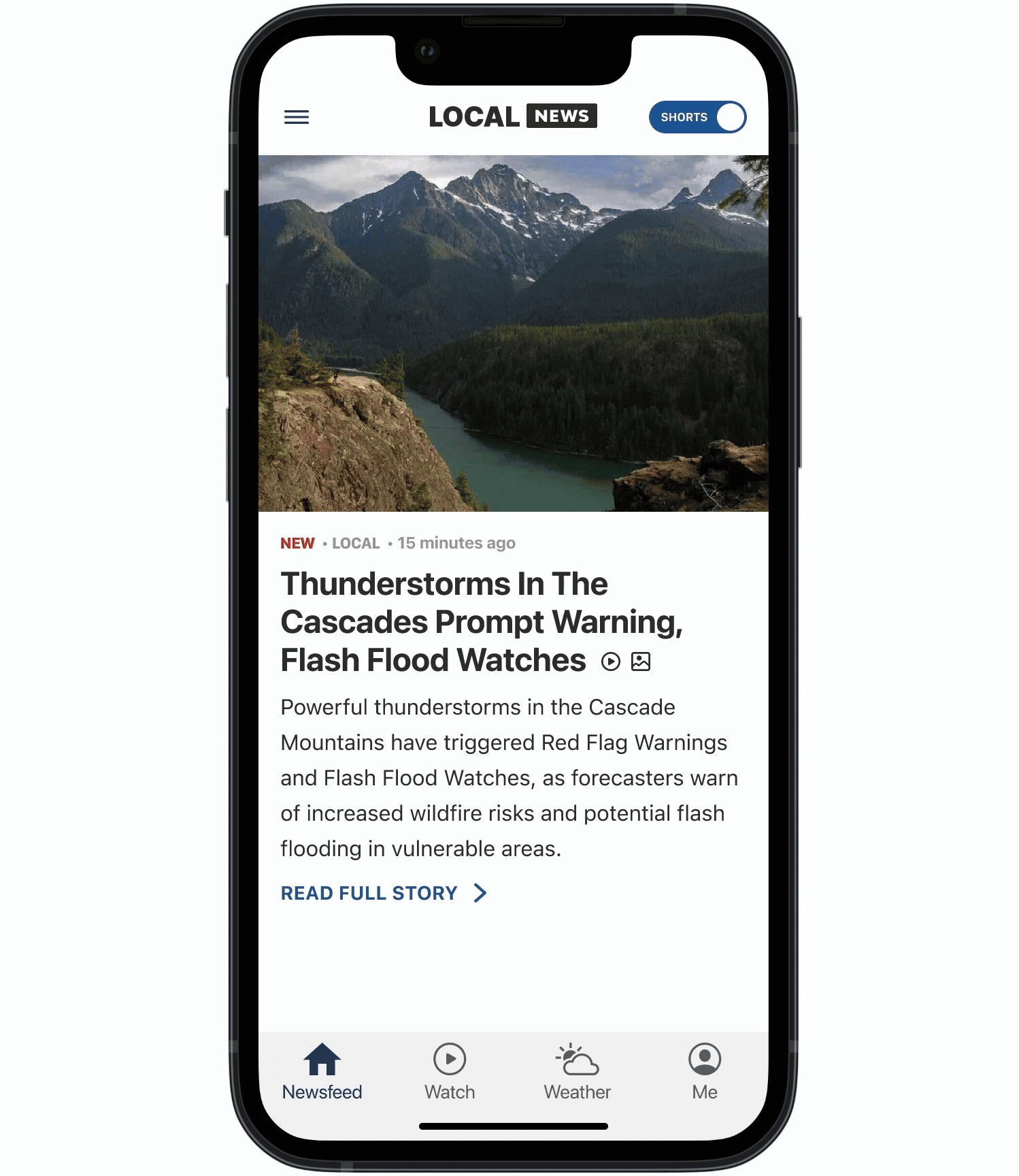
The core of the experience is a vertically scrollable feed combining video-based content and story summaries. Users can swipe vertically to navigate content, tap to access full story details, and continue browsing through an infinite scroll experience. Rather than introducing new interaction paradigms, the design builds on established behaviors to reduce learning friction.
AI-generated summaries
Each story is paired with an AI-generated summary designed for quick comprehension. Summaries are constrained by character limits to ensure immediate clarity and consistent readability. They provide enough context for users to understand the story at a glance while encouraging deeper engagement when needed.
Navigation and transition
Introducing a new interaction model presented a risk to existing users. To address this, the experience supports a dual-mode system consisting of the shorts feed and the legacy list view. Users can switch between both modes at any time, allowing them to explore the new experience without losing access to familiar navigation patterns.
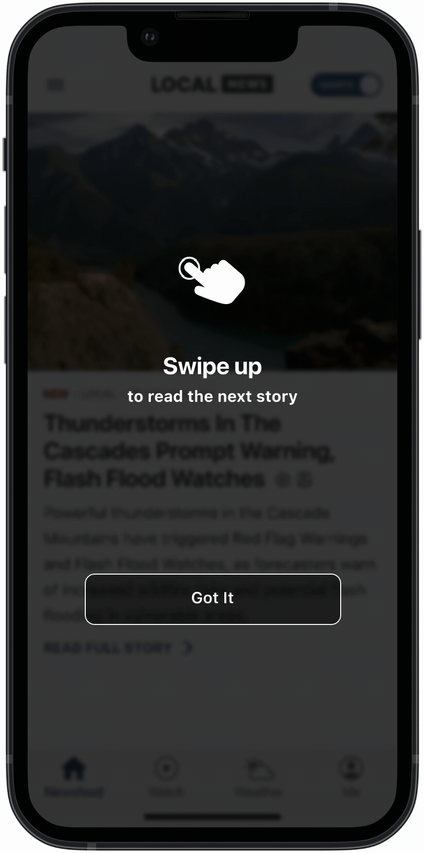
Onboarding and guidance
To support adoption across a diverse user base, lightweight onboarding elements were introduced. These include entry overlays for first-time exposure and contextual tooltips explaining key interactions. The guidance system was designed to be present but non-intrusive, allowing users to learn progressively.
Onboarding Overlay
Toggle Tooltip
Swipe Up Cue
Accessibility and UI adaptation
The interface was designed to accommodate a wide range of users, including those with accessibility needs. This includes support for dynamic font scaling without breaking layouts, adaptive teaser imagery to maintain visual balance, and a clean interface to reduce cognitive load.
Monetization
The shift to a feed-based model introduced new opportunities for ad integration. Ad placements were adapted to align with the short-form format, allowing them to feel more native within the scrolling experience.
Implementation Reality
While the experience was fully designed as an end-to-end system, several constraints shaped the initial release. The team was unable to implement a fully native video solution, resulting in a sub-optimal playback experience.
Content delivery relied on producer-curated APIs, which led to limited content availability and repeated exposure to the same stories.
During development, stakeholder priorities shifted toward a video-first rollout, resulting in the descoping of story-based shorts for a later phase.
The feature was released to beta stations due to these limitations.
Early Learnings
Early tracking data indicated strong initial engagement with the video format.
Users frequently watched at least one video per session, suggesting interest in the experience. However, continued engagement was limited, largely due to insufficient content volume rather than interaction design.
This revealed that the primary constraint was not the experience itself, but the supporting content and infrastructure.
Reflection
This project highlights that redesigning a content experience is not only a design challenge, but a system-level transformation. The success of a short-form news model depends on the alignment between interaction design, content strategy, and technical infrastructure.
Future iterations would focus on completing the full experience as designed, implementing AI-driven recommendations, and improving content scalability to support sustained engagement.


